

When you think about a popular brand like Apple or Nike, what image or idea pops in your mind? Is it the logo, or maybe the tagline of the brand? Although your mind may associate a brand with just one or two visual elements, the truth is that each brand is comprised of a whole lot of them. Many of these elements aren’t usually apparent or even tangible. However, they do affect your thought process and make a connection with you even when you are not aware. This is made possible by using psychology principles in design.

Since what you see about a brand affects how you perceive it in general, if you want to create a unique and powerful brand identity of your own business, then it’s critical that you get the visuals right. You mainly need to focus on 5 key elements which are:
1. Logo
The logo is easily the most visual element of a brand as it’s the face of the entire organization, a symbol of everything that it stands for. But what are the qualities of a great logo? Well, an ideal logo is:
- Unique: If a logo is unoriginal or looks similar to another popular brand, then it defeats its purpose which is to help the organization stand out. So, while it may draw inspiration from popular designs, its final version should look unlike any other design out there.
- Simple: The basic quality of a professional and powerful logo is that it’s simple and easy to memorize. There are countless examples of industry leaders that have created iconic logos based on this principle including Nike, Samsung, Adidas, etc.
- Scalable: Logos are used on a variety of places and items including billboards, napkins, office supplies, etc. Thus, they should look good when scaled up or scaled down.
Since designing the perfect logo is easier said than done, it’s best if you can hire a professional logo designer who has at least a few years of experience in the industry. However, if you are on a tight budget, then you can also try a logo maker. These days there are a variety of logo design programs that you can use to create high-quality logos easily and that too without breaking the bank.
2. Color Palette
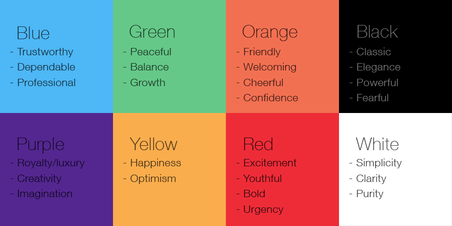
It’s not advisable that you pick the colors that you “feel” are good for your brand. Instead, you should learn about the relationship between logo colors and branding i.e. what your logo’s color says about your company, because believe it or not, each color reflects certain emotions and ideas. For instance, if you want to suggest authority with your brand, then your primary color should be black. Similarly, if you want to invoke the feelings of passion and excitement in your customers, then red is the color you should go for.
Naturally, you can’t select just one color for your entire brand; you have to pick a few. However, it’s best to keep the maximum colors in your palette up to 3. Using too many colors only leads to more confusion and lowers the impact of your brand’s overall personality. Another thing you want to keep in mind is that the colors should go well with each other. For instance, some of the classic color combinations are yellow and black, blue and green, yellow and red, etc.
3. Images
No matter what kind of business you are running, if you want to attract customers online, then you must impress them with high-quality content, a lot of which will use images. Think about it, you will need images for your website, blogs, social media, advertisements, newsletters and more. Although it may seem like a hassle to get professional images that are consistent with your brand image on a daily basis, it’s something you can’t overlook. That said, you can make your job a lot easier by educating yourself on the subject and learn the basics.
For starters, you can learn how to take great pictures for your website by learning about proper lighting, equipment, camera angles, etc. This step is especially important if you are selling physical items that you need to display on your website. You can learn how to use basic image editing tools to make your raw images look even better.
4. Fonts
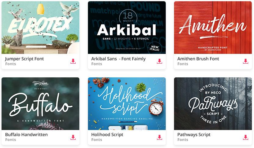
You may have a reason to think that typography isn’t that important when it comes to branding. After all, it’s just text, right? The truth is that the fonts you pick are often the most important part of your brand’s identity. For instance, you can take a look at the logo of Coca-Cola which is known for its iconic typeface. So, yes, if you want to create a unique identity for your brand, then you must pick a unique font.
When picking a font for your logo, make sure that it looks vastly different than what your rivals are using. Of course, it should go along with the brand too. For your website, you can pick a different font or two. Just make sure that all your fonts are appropriately spaced, legible, and look professional.
5. Supporting Graphics
The supporting graphics include your collection of icons, textures, and other design assets. Not only you have to ensure that these are polished and up to your brand’s standards, but you also have to settle on various preferences. These include padding of the icons, background colors, selection of geometric shapes that must be used, etc.
Summing it Up
In an age where new startups are launched every hour, you can’t underestimate the importance of your brand identity. If you are not careful enough, you can end up creating a brand that’s too generic to survive the competition. So, make sure that you apply the information above to create a brand that’s one of a kind and can be identified even when it’s surrounded by a hundred other brands. Good luck!